February 01, 2006
New île sans fil logo
Posted by bopuc at February 1, 2006 12:48 AM
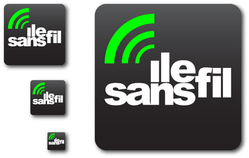
Mike linked to the announcement of the new ISF logo.
Here's what they unveiled:

Here's my suggested fix:

Basically, I lined things up, centered the text-mark, instilled some harmony by adjusting the kerning a bit better, got rid of the little green blurry nugget (I know it's supposed to be the "accent circonflexe" from île, but I think the waves can cover that duty themsleves) and changed the font of the URL.
Update:
Can you tell this isn't my forte? The edges of the radio waves aren't rounded and I totally not happy with the kerning and alignment here but I'm tired... ;)

Anyways. I stop here. I also really wanna apologize to the dude who made the original. I know how much work doing this kinda thing is, and how working pro bono is, etc. Dunno, it just didn't seem "all that it could be"... :\