January 31, 2006 19:48 | Montreal

New île sans fil logo

Mike linked to the announcement of the new ISF logo.

Here's what they unveiled:
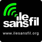
Isf Logo

Here's my suggested fix:

Isf-Linedup

Basically, I lined things up, centered the text-mark, instilled some harmony by adjusting the kerning a bit better, got rid of the little green blurry nugget (I know it's supposed to be the "accent circonflexe" from île, but I think the waves can cover that duty themsleves) and changed the font of the URL.

Update:
Can you tell this isn't my forte? The edges of the radio waves aren't rounded and I totally not happy with the kerning and alignment here but I'm tired... ;)
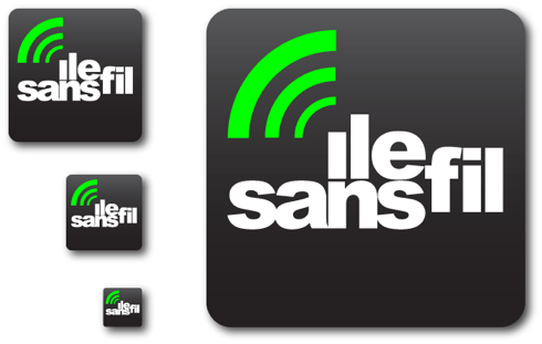
Isf-Redo-1

Anyways. I stop here. The original's a pretty good idea and start to a logo... I just felt like tweaking it a bit to fit into the grid I see in my head. ;)

Comments

wow! that's really nice of you. We were planning on making the "i" line up - but the rest of the changes are great too. I'll go see what the guys think.

thanks!


The key question is how do they both look at 50 by 50 pixels. That's the key. Me goes with B.


Thnx Warren, totally agreed. A couple of issues with this thing, the original and mine. :)


The second one is much better. but what "ile sans fil" means? :))))))
I mean it's in the name and the URI :) Is it necessary to have both?


karl, you raise a number of issues, but the main one I'd like to address is "application".

At 50px x 50px you are most likely already on the website anyways, or a website linking to ilesansfil.org, so yes at that size the URI does not need to appear.

On a flyer or business car or some such, a logo that size is probably also accompanied with some sort of marketing text etc which would also accommodate the URI being written out elsewhere than in the logo.

Then there would be teh largish 6"X6" ISF sticker a hotspot location might place in its window. At that size, a URI would fit quite nicely and would be useful since no other supporting material is present.

as for the "meaning" of this specific juxtaposition of this seemingly random set of roman characters... I think it means "free community wifi for montreal" etc etc... ;)

I actually going to go and redo this logo in various size and for various applications right now. stay tuned.


"I actually going to go and redo this logo in various size and for various applications right now. stay tuned."

. . . uh? . . More "yay"-ing from me!

and that's a good point about the url re: different sizes/applications. I wouldn't have thought of that.


Much better... but it still reads like "Lle Fil Sans" to me... :p


hello folks!

nice feedback. a few things:

1- i remember the first drafts had non-rounded waves.
im much happier with the rounded waves, the non-rounded waves reminds me of radio shack or those other corporate places that use wifi waves. i like rounded :)i'll vote for this till the end!

2- the kerning. sure, looks great. i'll change it to that if the concensus is FOR it.

3- the use of the "URL" in the logo, is preciscly that. it appears when NOT on the web, mostly in the print related logos. the only places it WOULDNT appear, is say as a weblink. pretty much what you would expect.

4- the gradient is nice, i had the same thing in one of the earlier drafts but i dont think that its a good idea in the print-campaign because gradients depending on what process your using to print can come out differently. also, it makes it hard to print off 2 or 4 color jobs. also more expensive. for the web, im sure it can be used but again. solid black is much more powerful, and iconic. gradients might look abit less professional.

these are of course only my 2cents. im happy to see the logo posted and discussed. thanks for all the feedback.

the only one thing im really concerned about is the loss of the "nugget" or "circonflexe". if thats something we want to do, i'd need to know soonish cause we are in the midst of preparing the cards / chloroplast signs / stickers.

personally. i say it looks good without, but probably should have it. (and it looks good with it too!)

*safe solvent
(tired and awake at 7:33am)


looked at them again, i think that the "circonflexe" could go and it would look good, make sense and actually help the design (in terms of taking some HEIGHT away from it)

(its just a matter of deciding soon i guess)


Hey! Hi SafeSolvent! :)
I was tired and awake at 2am when I did that last round. ;)

Yeah totally agreed on the rounded waves (too lazy to do them from scratch) and the gradient/drop shadow (was just playing around).

I'm glad my putsing around was appreciated. I was worried of angering folks. :(
(Especially since I was not part of the original process, and I have been in this kind of thing before and to have an outsider pipe up at the end is just annoying right? ;)


Looks like the new RSS feed icons. They chose a symbol that I'm sure I've used a lot of times as a designer - a bit too general.


Actually, I used the feedicon source file for those waves (slightly modified, but too lazy to round the edges.)

Having worked for a WiFi AP/router maker for 3 years, I've seen too many of those waves myself. :p


13- mike Frenette

Hi. There is one major flaw with the design. It goes angainst the emotional matrix. The soundwaves are going upwards left OR give the impression of a line going down (from top left to down right). In bothe cases, it adds a 'negative' connotation or something 'from the past'.

The airwaves shoud go upawards right. The letters should be redisgned around this. Maybe, this way, the first letter 'I'm not sure if it's a 'i' or not), would not produce this ambiguity as to wether or not it is a letter.