June 27, 2006 17:37 | WebBlogging

Launched another redesign

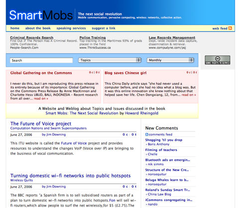
Just launched Howard Rheingold's SmartMobs redesign.

Smartmobs new

Work on this started months ago and Howard was patient enough to wait through my completing other jobs. I'm quite happy with this redesign. I'd say it's a "Boris-flavored mash-up of Khoi Vinh and 'Web 2.0-ish' styles."

;)

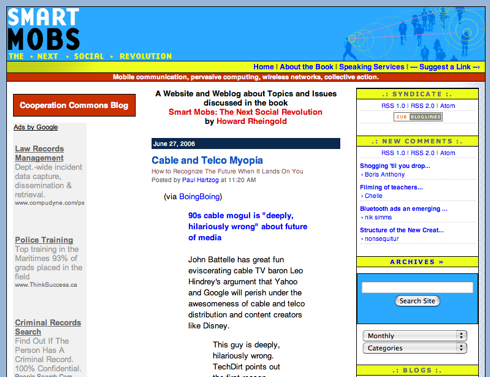
Here's an idea of what the homepage used to look like:

old smartmobs

I think we can all agree... "it's muuuuch better!"
Comments

Thought for a second that your included screenshot was the new design.

It's ... uh, real nice man.

=)


Have to say that Khoi's got one thing ass backwards: the entries lower down on the page on Smart Mobs and his site both get shorter further back in time. I think that's wrong - if I'm scrolling down, I should be rewarded with greater detail, right?


hah, points taken. added new screenshot at top... and will ponder the ass-backwardness... Your argument "can make sense", but if it is desirable as an implementation...

My inclination was to reduce the "older listing on the homepage' even more in size... font-size, real-estate etc... We *are* talking old content, no longer necessarily featured, and certainly not meant to be highlighted...

Or???

hrmmm... pondering...


I will say that in my eyes, you are the undisputed master of formatting single blog posts - the title / topic / date / author / comments areas are really nice.


Haha, that's fun : I just saw the new version this morning and now I discover you did it :)

Great improvement obviously ! I agree with Michal concerning the scroll down thing.

also, in the top left red box (at the present time entitled "Global Gathering on the Commons"), the last line is cut. Probably you made it with a constant height and they put a message too long...


nice. Very clean. hmm, gotta say though, right now my eyes are saying 'where am I supposed to look?' The Google ads and the pulldown navs take up space where I'd expect to see headlines - and if those stories in the red boxes are the 'leads' then I'd expect their headlines to be bumped up in size at least a level or two. but that's just me, maybe.


thnx for the feedback.
Stéphane: yeah, the features are set height. chop chop!
AJ; yeah, I have a predisposition for small font sizes. might bump those a bit though as you suggest.

re: google ads. they are a source of revenue for Howard and I had to make them prominent. I walk a fine line here between giving them prime real-estate and toning them down color-wise. Also, the right side usually would be Federated Media ads. When they don't sell any space for us, they pipe in an AdSense channel.

I make a living shaking the devil's hand and saying I'm only kidding. ;)


Hey, I'm glad you did that! And I take this as a reminder that I should be posting stuff at the site...